Studio Noel Publishing
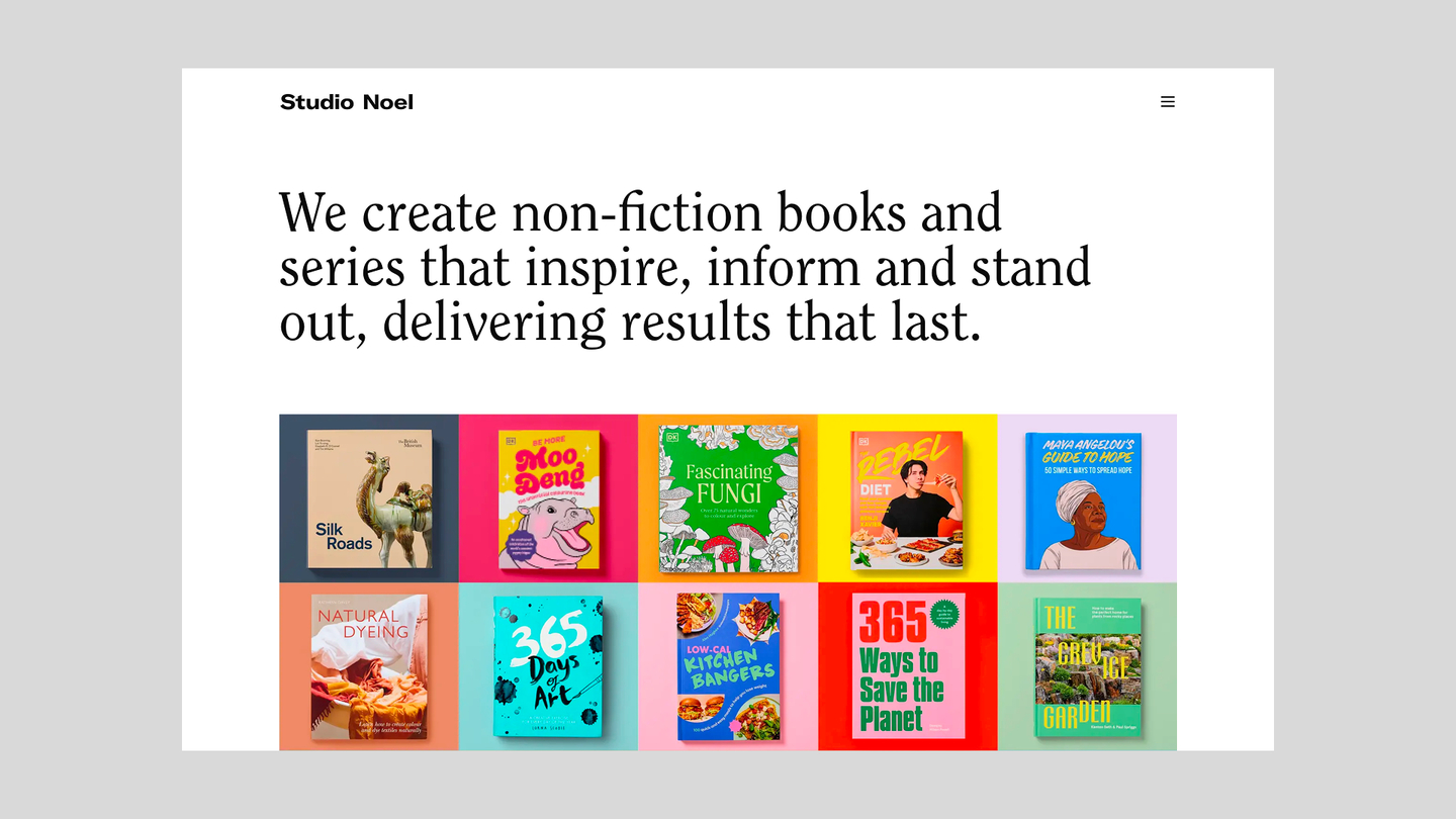
An image driven publishing website for a branding agency, engineered from wireframe to live product.
Problem
Studio Noel — a branding agency I’ve collaborated with for over 15 years — needed a completely original publishing website. The brief was for something clean, fast, flexible, and built for longevity — including their first migration to a headless CMS. I took full ownership of converting their visual designs and wireframes into a UI system, frontend engineering, and CMS architecture.
As a design agency specialising in accessibility I also built critical CI checks to ensure WCAG 2.2 AA compliance from the beginning.
Visit Studio Noel Publishing.
Design System
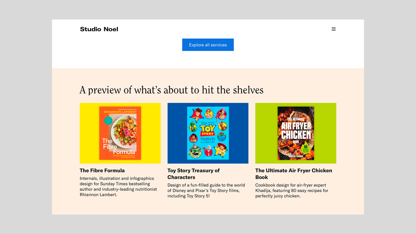
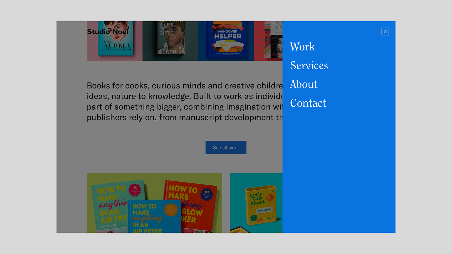
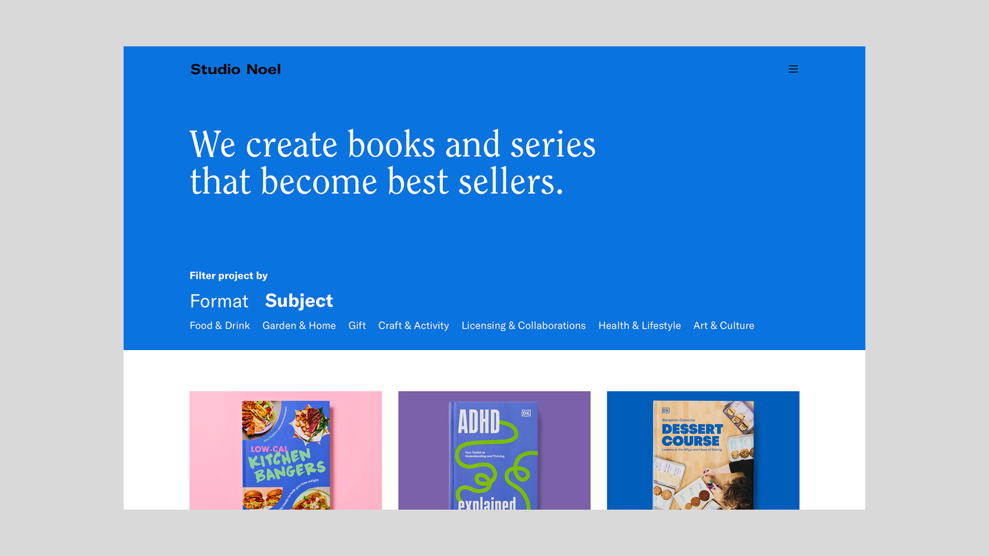
I developed the accessible and responsive UI component library from their existing brand identity and website. Building a new design system following existing designs, typography, spacing, colour; rather than inheriting any inconsistencies in what came before.
The result is a smooth, well-aligned, responsive, and visually consistent website. Upon launch Studio Noel’s clients instantly started complimenting them on the quality and craft.
Luke brings a level of rigour that’s hard to find. Every project starts with clear thinking around architecture and structure, which means builds are stable, scalable, and don’t need reworking later. That thinking extends into how he approaches design systems and scalable UI, translating design into robust, reusable components that ensure consistency across the entire product, not just at launch but as it evolves.
— Michelle Noel, Founder & Strategy Director
CMS architecture
This was the client’s first experience with a headless CMS, so the measure of success wasn’t just technical — it was whether a busy, details-focused team could feel confident using it day-to-day and know their layout and quality would always be maintained.
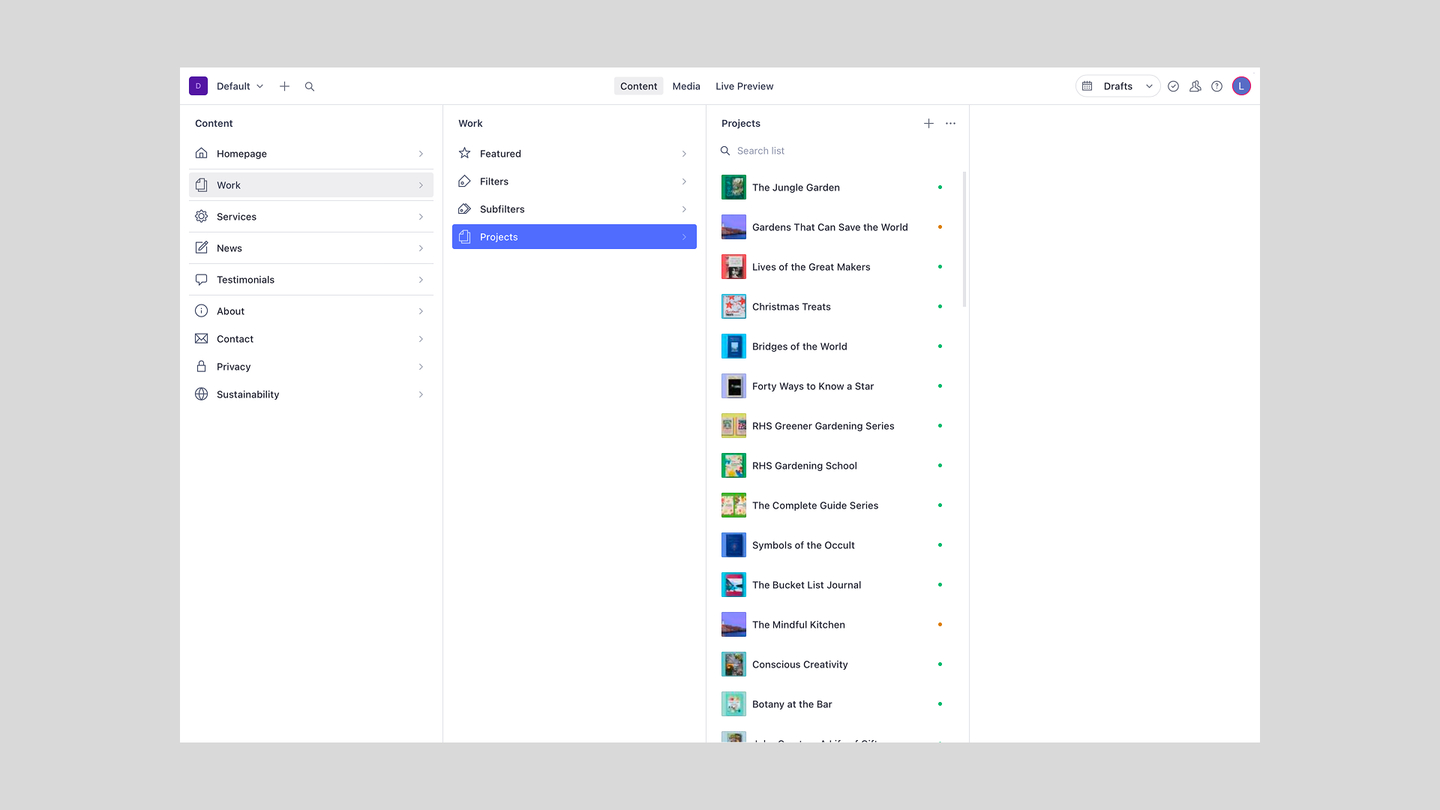
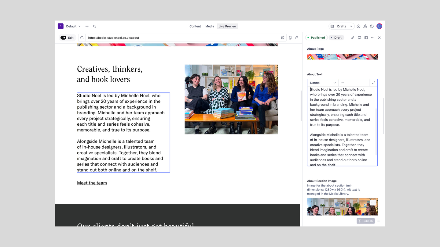
I designed a custom content hierarchy in Sanity tailored specifically to their publishing workflow. The studio gets in-built live visual preview while editing, image batch management to simplify media-heavy workflows, and a clear draft vs. published state throughout. Every editorial decision was made with the same question: does this feel effortless for someone who doesn’t think about CMS architecture?
Existing integrations
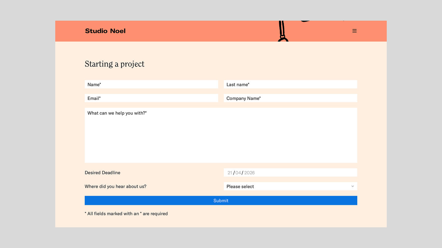
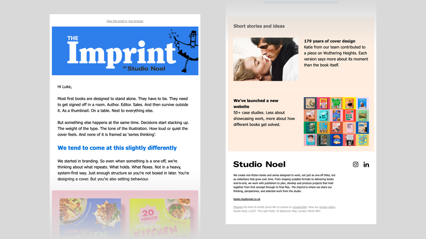
The website also integrates natively with their existing Mailchimp and Zapier workflows via REST APIs, preserving the operational processes already in place without requiring any changes to how the team works.
Key decisions
I chose Next.js and React for the website because it allowed for dynamic pages that change weekly I chose ISR combined with SWR and long cache times. Other pages remain statically generated for better SEO and fast load times, revalidated automatically whenever new content is published in Sanity, with no full rebuild required.
Additionally I relied on Shadcn + Tailwind for interactive components, and accessibility is enforced automatically on every pull request via a Playwright + Lighthouse CI/CD pipeline. The site is fully WCAG 2.2 AA compliant, including keyboard navigation, screen reader support, and focus management throughout.
Result
The site launched with a perfect 100/100 Lighthouse score across performance, accessibility, best practices, and SEO. The client has already received unsolicited praise from their own clients about the design and build quality — a signal that the visual investment landed where it needed to. The project has laid the groundwork for a broader relationship, with the main agency site to follow in the same stack. I continue to provide ongoing maintenance and support, keeping the platform stable as their requirements grow.
“We’ve partnered with Luke on our publishing website and multiple client builds, and he’s been a consistently reliable and high-quality technical lead across all of them. He works quickly and efficiently, but never cuts corners. He approaches projects with a strong sense of ownership, from early scoping through to final delivery.
What makes the biggest difference is how he integrates with the team. He doesn’t just execute a brief, he contributes, challenges, and helps shape better outcomes. That combination of speed, structure, and genuine care makes him a very safe pair of hands.”
— Michelle Noel, Founder & Strategy Director